


Colour Terminology
Achromatic colours

As they are without hue, these are not technically categorized as colours. These range from white through to black, and are sometimes known as sensations.
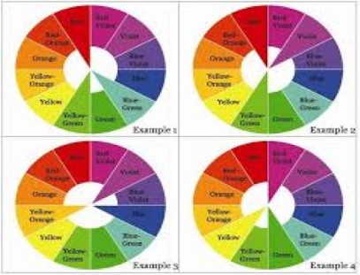
Analogous colours
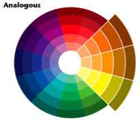
Colours next to one another, on the colour wheel which share strong flavours, creating a pleasing harmony. Analogous colours occupy any three consecutive colours on the colour wheel. They are vibrant in colour and are easy to work with. The two examples above show green to yellow and also yellow to orange.
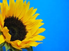
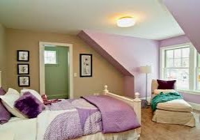
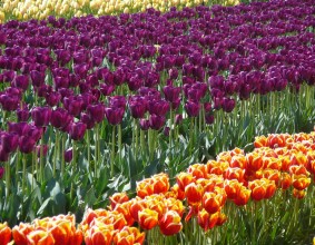
Advancing Colours
![]()
Warm colours such as red and yellow which create the feeling of advancing towards the eye.
Accent Colours

A colour used in small quantities to pick up or add slam to a colour scheme. In the example above a burgundy is utilized.
Complimentary Colours
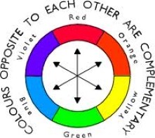
Colours directly opposite one another on the colour wheel. They are contrasting and impart liveliness, fire and spirit.( also see split complimentary )
Contrasting Colours
Colours that are opposite each other on the colour wheel but not necessarily directly.
Contrasting Harmony
This is where you take various colours from the colour wheel to produce a pleasing outcome. I find the best examples are to be found in nature. God is the greatest artist and knows how to use colour.
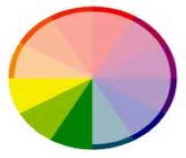
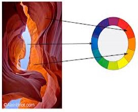
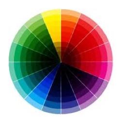
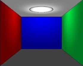
Cool Colours
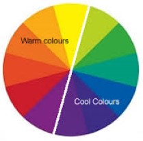

Colours found on the right hand side of the colour wheel above, which give the appearance of coolness.
Discordant colours
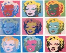
A reversal of the natural colour order producing an unpleasant appearance to the eye. Discordance means that motion produced between colours is not simply fast but agitated. Discordant colours, like complimentary colours, seem to draw and repel from each other at the same time, but these colours are not balanced as with complimentary colours. Simply put, they are colours that do not go together. A reason for using discordant colours may be for attention grabbing because the eye will naturally be drawn to something that is out of place. If your aim is to draw attention to a particular object, a discordant colour scheme would certainly work. Above are a couple examples of Andy Warhol's work, a master of the discordant colours.
Harmonious Colours
Simply put, colours that appear pleasing when used together. Above is an example of the related complimentary colours red, orange with their split complimentary colour pale blue. ( see also Contrasting Harmony )
Juxtaposition
When you place one colour next to another a distortion may occur, giving the semblance of other colours being represented. For example, when you place red and yellow together, the red will have a purplish tinge and the yellow will have a greenish appearance.
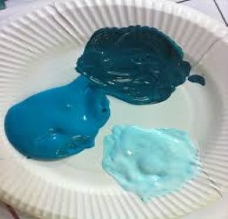
Monochromatic colour

When adding tints ( white ) and shades ( black ) to one colour you can create a tonal scale of that type colour. They are all hues ( variants ) of one colour element on the colour wheel, showing the dark, medium and light values of that colour. See example above.
Natural order of colour
The rainbow's lightest colour is yellow, which is on the outside of the colour wheel, and it's darkest is deep purple, which is in the centre of the colour wheel. In this order, the colours are pleasing to the eye, but if the darkest colours such as purple became the lightest, they would then become unpleasant to the eye and discordant.
Neutrals
These all go together and can be layered and mixed and matched without one overpowering the other. They are non-colours - black, grey, white - and sometimes brown and beige.
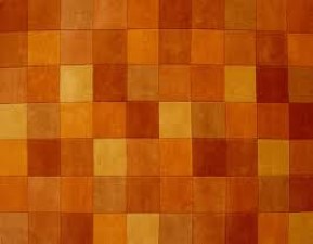
Pastel colours
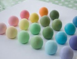
This usually refers to pale colours with plenty of white
( tint ) supplied to them. Colours that have tints or shades added. See above.
Primary colours
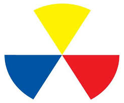
The three main colours - red, blue, and yellow. They cannot be made from any other colour.
Receding colours

Opposite to advancing colours, these are cool colours such as blue/light blue which are used give the appearance of retreating from sight.
Saturation
The extremity of a colour.
Secondary Colours
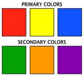
Blend equal amounts of primary colours and you get the secondary colours - purple, green and orange.
Split Complimentary
In the colour scheme, you can use one hue, contrasted with two hues either side of the complimentary colour. Colours one step either side of the compliments own analogous colour ( see above ).
Shades
Add black to the main colour or hue and a shade is made.
Tertiary Colours
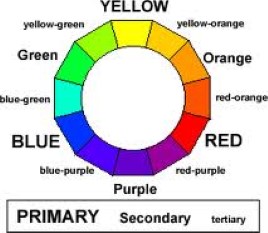
If you mix a primary colour with a secondary colour, in a ratio of 2:1, you get a tertiary colour - yellow,orange, blue,green, etc.
Tints
Basically lightening up a colour, tints are colours produced when you add white to a main colour.
Tones

A colour's lightness and darkness: for example , dark brown or light brown.
Warm Colours
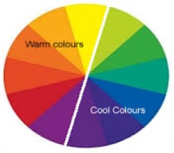
Colours found on the left hand side of the colour wheel above, which promote the feeling of warmness.
Please note, all photos and text are used for training and educational purposes only.
Copyright Disclaimer Under Section 107 of the Copyright Act 1976, allowance is made for "fair use" for purposes such as criticism, comment, news reporting, teaching, scholarship, and research. Fair use is a use permitted by copyright statute that might otherwise be infringing. Non-profit, educational or personal use tips the balance in favour of fair use.